


Color harmony at home: what happens when we apply the principles of fashion and cosmetics to the home?
We draw on the seasonal palettes of color harmony to choose colors without stress.
But first of all: what is color harmony?
Color harmony involves identifying a range of colors that enhance your chromatic and, therefore, physical characteristics. In other words, it's the study that analyzes how your colors (skin, eyes, hair, etc.) react when combined with other colors.
The goal is to understand which colors look best on you, and then take them into account when choosing clothing, accessories, and makeup.
In fashion, color seasons (spring, summer, fall, and winter) are used to identify the palettes that flatter a person. Each palette has colors that share factors such as brightness, saturation, and color temperature .
Broadly speaking, spring has bright, vibrant colors, summer has light colors, autumn features a palette of warm, enveloping hues, and winter has cool, medium-dark colors.
In short, each season presents a set of shades that work well together and look good on the person who corresponds to that particular color season.
In reality, this is an extreme simplification, no offence to the colour harmony experts.

What happens if we apply the principles of color harmony to furniture?
At home, color harmony becomes a precious ally for:
- choosing the colors to decorate your home , creating balanced and welcoming environments.
- define the right atmosphere for each room;
- avoid mistakes when matching colors at home , thanks to harmonious and well-studied palettes;
- choose the metal finishes to use for faucets, window handles, lamps and furniture knobs.
Now that you know the benefits of color harmony in home environments, get ready to discover the colors of each palette.
Matching colors at home with color harmony
But how do you apply color harmony at home? If you're unsure which colors to choose, "steal" them from the seasonal color harmony palettes, which also provide guidance on the metallic details you can choose for your decor.
Each palette helps create a particular atmosphere or style in the home.
Let's explore some of the colors of each season. Before we do, though, a premise .
When we talk about "warm" or "cool" colors , we're also referring to the warmer or cooler shades of a given color. For example , between olive green and emerald green, the former appears warmer and the latter cooler; between brick red and watermelon red, the former appears warmer, the latter cooler, and so on.
Here is a selection of colors for every season.
Spring
The colors of the Spring palette are bright, medium-light and warm.
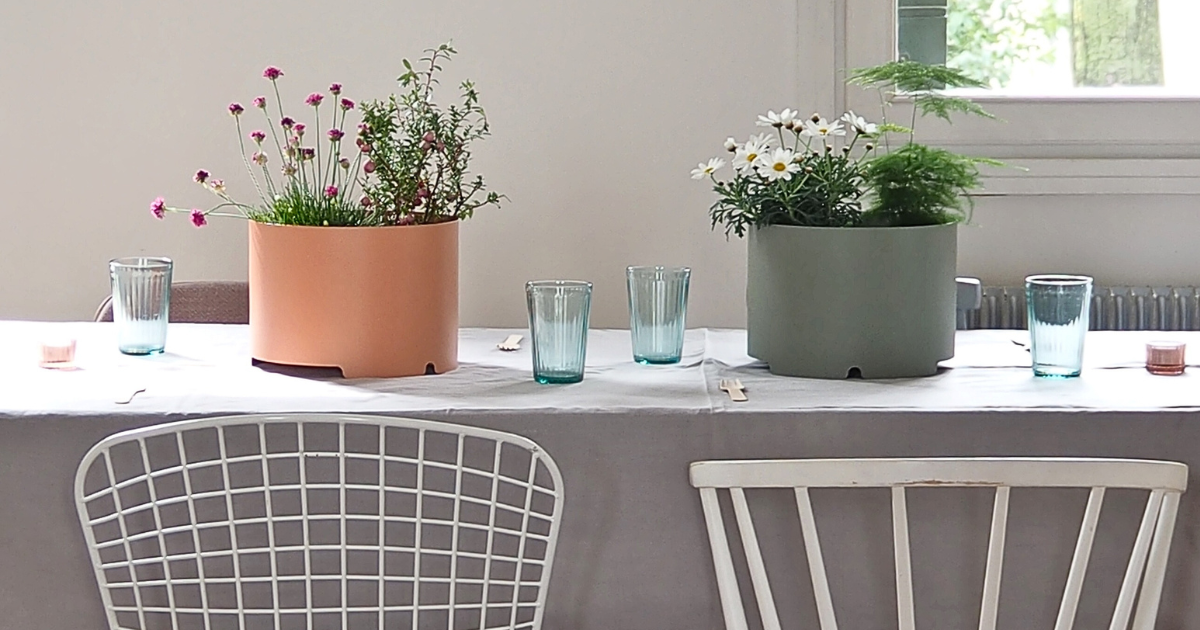
Some examples include peach, turquoise, coral, periwinkle, melon yellow , lime green orange, and pure red.
The neutral colors in this palette are light gray, taupe, and golden beige. They pair with warm whites to create a cheerful, vibrant, and energizing atmosphere .
The metals that match the spring palette are yellow gold and rose gold.
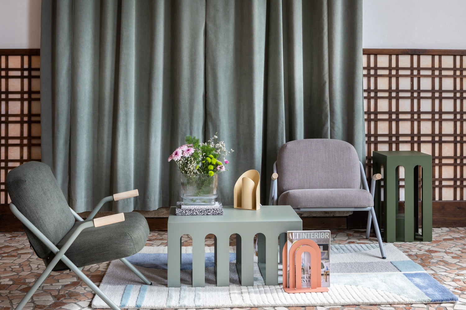
All of these shades look great with Mid-Century Modern style interiors.
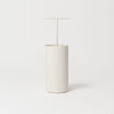
Summer
The Summer palette is made up of cool, delicate and powdery colours.
Some representative shades are lavender, pastel blue (cerulean), watermelon, light pink, sand and pearl gray.
They look good with whites containing a few drops of blue or gray and with light, low-saturation neutrals such as light sand, dove gray and pearl gray.
Metallic details to combine with the colors of the summer palette at home can be silver.
The Estate palette is perfect for creating poetic, romantic and refined interiors .
The colors appear to have a dusty patina, making them perfect for contrasting antique or traditional furniture with minimalist, contemporary pieces.

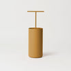
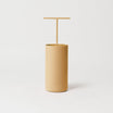
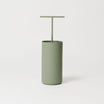
Fall
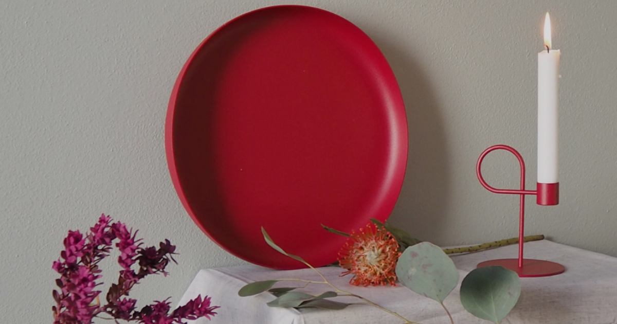
The Autumn palette focuses on warm, earthy, and spicy colors. These include mustard, khaki, rust, cinnamon , olive green , chocolate brown, and brick red.
They go well with warm whites and warm, not too light neutral shades such as sand, honey and greys that contain a hint of yellow.
The metals of the autumn season, to be combined with the colours just mentioned, are
The combination of these colors creates an incredibly welcoming and intriguing environment. The Autumn palette pairs beautifully with natural-style interiors or spaces with rustic, textured touches .

Winter
It includes cool, dark and intriguing shades, such as black, midnight blue , ruby red, dark purple, dark teal, electric blue and fuchsia.
They pair well with optical whites and neutral shades like anthracite, dark taupe, rosy taupe, and charcoal. Plus, the Winter palette is the only one that also allows black.
If you love this palette, you can choose the metallic details in steel, black or silver.
These colors are perfect for giving your home a contemporary and sophisticated look , with a few touches of pizzazz.

Matching your home to your color scheme: yes or no?
Your home is much more than just a living space: it's a reflection of your essence , a place that expresses who you are and welcomes you in harmony with your personality . Choosing colors in your seasonal palette means living in a space that makes you feel truly part of the house .
Imagine the effect: even clothes left out of place will blend in perfectly, matching the surroundings! And for those who love sharing their lives on social media, the home becomes the ideal setting for color-coded shots , where everything fits perfectly with your personal style.
However, you don't have to feel tied to your season's palette : you can choose any color combination that makes you feel good and helps you make the most of your spaces.
Your home palette should make you feel good: if you're a "summer" and love the warm tones of autumn, there's absolutely nothing stopping you from using them in your decor .
Using color harmony at home to add color
- Balanced palette: You can use neutrals as a base and add pops of color to liven up the space.
- Subtle contrasts: Pair warm neutrals with bright or spicy colors and cool neutrals with dusty or cool, dark shades.
- Personalization: Follow the color harmony palettes to choose colors that reflect who lives in the space, without being afraid to dare.
In short, color harmony in architecture allows you to overcome the fear of color, transforming each project into a customized environment that is not only beautiful to look at but also pleasant to live in.
DISCOVER ALL THE COLORS OF THE HIRO COLLECTION AND CREATE YOUR OWN PALETTE

